Choose a Visualization
Part of designing an effective Insight is selecting the appropriate visualization type. A Visualization presents data in an intuitive graphical form such as a pie chart, line graph, or bar chart.
Incorta Insights can be illustrated with the following categories of visualizations:
- Data Fields/KPIs
- Tables
- Charts
- Gauges
The choice of a visualization type is not set in stone; after defining an Insight in the Analyzer, you can still change the visualization type to whatever you find as the best fit. You can even change a visualization type to a completely different one, such as transforming a table into a column chart. In this article, you will find a description of each of these types to help you decide what best represents the data in your dashboard.
Data Labels/KPIs
As the name suggests, a KPI (Key Performance Indicator) is a measurement of performance for a business process. A KPI Insight presents key data in the form of a single value to provide instant feedback on the state of the business.
KPIs are presented as a Data Label visualization.
Table Types
The Incorta Unified Data Analytics Platform provides a wide and flexible selection of tables, from simple row-column tables to pivot and summary tables that display complex relationships between dimensions. These tables can group data and make measurements using aggregate functions including Sum, Count, Average, Median, Maximum, and Minimum to make large amounts of data meaningful at a glance.
The main difference between Table and all Aggregated Tables is that the Insight Setting for the Aggregated property is enabled.
Disable this property and the visualization reverts to a simple Table.
Chart Types
| Chart Type | Example | Description |
|---|---|---|
| Column (Vertical-Bar) Chart |

|
Plot grouping dimensions on the (horizontal) x-axis,and measures on the (vertical) y-axis. The first added attribute to the “grouping dimension”field is used for data slicing. Additional attributes to this field enables the user to select one group, filter the data on that value, and drill down to the next dimension. Additional measures are represented by different colors. |
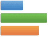
| Bar Chart |
|
This chart is similar to the column chart representing the data in horizontal bars rather than vertical columns. Using this chart, you can plot grouping dimensions on the (vertical) y-axis versus measures on the (horizontal) x-axis. Additional measures are represented by different colors. |
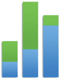
| Stacked-Column Chart |
|
Use this chart to display multiple categories in each column. The colored bands represent slicing of the total by the coloring dimension. Attributes in the grouping dimension field define the x-axis of the chart. The bar represents the measure in the chart. The bar can be sliced according to the attributes in the “coloring dimension.” If you add two attributes to the “grouping dimension” field, you can filter by one year, drill down to quarters in that year, and keep data sliced using the coloring dimension. If you add two attributes in the coloring dimension field (e.g. Product Category and Product), you can filter on one Product Category, drill down to the Products in that category, and see data for all the years. However, you cannot add two attributes to the grouping dimension field and two attributes to the coloring dimension field for this kind of chart. Use this type of chart to stack multiple measures by adding two or more measures to the measure field and no attributes to the coloring dimension field. You cannot add multiple measures and a coloring dimension in this type of chart. |
| Stacked-Bar Chart |  |
This chart is similar to the Stacked-Column chart representing data in horizontal bars rather than vertical columns. |
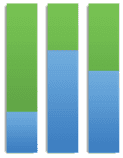
| Percentage Column Chart |
|
Use this chart type to represent data in columns sliced by the coloring dimension and represented as a percentage of a total. This chart is similar to the Stacked-Column Chart in terms of adding dimensions and measures. However, it is not used to analyze measure values. It represents the relative percentage of each coloring (or slicing) dimension compared to the whole measure value for that grouping dimension value. |
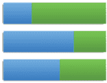
| Percentage Bar Chart |
|
As in the Percentage Column Chart, use this chart type to represent data in bars sliced by the coloring dimension and represented as a percentage of a total. |
| Combo Dual Axis Chart |

|
Use this chart when you want to plot two different measures on the same y-axis. The two measures will have the same scale. You only need to add a grouping dimension, and two measures to obtain this chart. Additional grouping dimensions will be used for drill-down. This type of chart is used when both analyzed measures have similar ranges. |
| Dual Axis Chart |
|
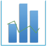
Use this chart type to plot two different measures on two separate y-axes, which can have different scales. This type requires at least one grouping dimension only, however, more grouping dimensions can be added to drill down. |
| Dual X-Axis Chart |

|
Use this chart type to plot two different measures on two separate x-axes, which can have different scales. This type requires at least one grouping dimension only, however, more grouping dimensions can be added to drill down. |
| Area Chart |

|
In this type of chart, the areas under the lines for multiple data series are overlayed on each other. This chart requires a grouping dimension and a measure. A coloring dimension can be added to slice the area for each dimension value by another dimension. Similar to the Stacked-Column Chart, you can choose to stack two measures, but then you cannot add a coloring dimension in that case. |
| Stacked-Area Chart |

|
This type of chart is also called a Subdivided Surface Chart or a “Band Chart.” If possible, use the Sort By function in your filters to plot the smoothest trend at the bottom of your chart. Only the data series plotted at the bottom of the chart starts at zero on the y-axis, each following series is plotted relative to the series below it. This chart type behaves similar to the Stacked-Column Chart except that the data is shown as colored areas instead of separate bars. |
| Percentage Area Chart |

|
This chart shows the area under the line as a percentage of the total. It behaves similar to the 100-Percent-Stacked Column Chart, except that the data is shown as colored areas, instead of separate vertical bars. |
| Line Chart |

|
This graph connects data points in the series with a line, but does not indicate exact values between data points. Additional measures will be represented by separate colored lines. |
| Stacked-Line Chart Only |  |
The data series plotted at the bottom of the chart starts at zero on the y-axis, each following series is plotted relative to the series below it. This chart behaves similar to the stacked column chart, except that the graphs are drawn with lines instead of vertical bars. |
| Percentage Line Chart |
|
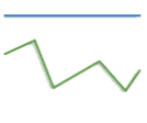
This graph shows each data point in the series as a percentage or part of 100% or of another specified threshold. This chart is similar to the 100-percent-stacked-column chart, except that the data is plotted as lines instead of vertical bars. |
| Spider Chart |
|
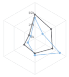
A spider chart can be used to represent actual vs target values. A radar chart can be used to represent multiple measures against 3 or more grouping dimension values. |
| Pyramid Chart |
|
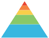
A pyramid chart can be used to represent categories based on their hierarchy, importance, or size. A pyramid chart requires one grouping dimension and one measure. It is the same as a funnel chart, but inverted. |
| Treemap Chart |

|
Treemap charts can be used to represent hierarchical structures, using a specific column for coloring. The size of the rectangle represents the value of the grouping dimension. Treemaps can also show the 2nd level of the grouping dimensions. Any hierarchical type data can be shown with a glimpse into the next level. They are useful for showing two levels of values at the same time. Treemaps only show 1 measure but 2 levels. |
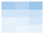
| Heatmap Chart |
|
Heatmap charts can be used to represent values of each slot using varying darkness. That is, the darker the slot, the higher the value it represents. |
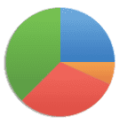
| Pie Chart |
|
Use a pie chart to display distinct categories of data. It can be used to slice one measure by one grouping dimension. Additional grouping dimensions can be added to allow for drill down from one dimension to the next. |
| Pie Donut Chart |

|
Use a pie chart to display distinct categories of data. It can be used to slice one measure by one grouping dimension. Additional grouping dimensions can be added to allow for drill down from one dimension to the next. |
| Donut Chart |

|
The donut chart is used in the same way as the pie chart, representing data sets in a donut rather than a pie. |
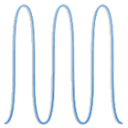
| Time Series |
|
Use this chart type to represent a time series uisng splines. This chart requires a minimum of one grouping dimension and a measure. The graph has zooming capabilities that enables the user to zoom in different periods. Additional grouping dimensions can be added for drill-down. Additional measures are represented by separate colored splines. |
| Line Time Series |

|
Use this chart type to represent a time series using lines. This chart requires a minimum of one grouping dimension and a measure. The graph has zooming capabilities that enables the user to zoom in different periods. Additional grouping dimensions can be added for drill-down. Additional measures are represented by separate colored lines. |
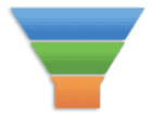
| Funnel Chart |
|
A funnel chart displays values as progressively decreasing proportions. The size of the area is determined by the series value as a percentage of the total of all values. |
| Scatter Chart |

|
The Scatter Chart is an X-Y plot in which each entity represented is assigned a symbol called a point shape. Both the x and y dimensions are quantitative; that is, they have magnitude. If there is an independent variable, place it on the x-axis. The grouping dimension is descriptive or categorical. The purpose of a scatterplot is to discover or illustrate correlations between the variables. |
| Bubble Chart |
|
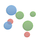
Use this chart type for a bubble representation of a grouping dimension (e.g. Product Subcategory) varying in size according to a numeric measure placed third in the measure field. In this chart, you must have three numeric elements in the measure field in a specific order (e.g. Revenue, Cost, Profit) . The first measure indicates the x-axis value, while the second measure indicates the y-axis value. Finally, the size of each bubble represents the magnitude of the third measure. |
| Bubble |
|
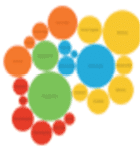
This chart type uses bubbles to represent a grouping dimension (e.g. Country) in varying sizes according to the element numerical value in the measure field (e.g. revenue) The grouping dimension labels each bubble. |
| Map Chart |

|
When you design a geographical chart in Incorta Analytics, the drill-down path should be Country, State/Province (use a column that contains the ISO state code), and a full address (street address, city, state). See Requirements for Map Charts for more information |
| Map Bubble |

|
This chart type maps the grouping dimension values (e.g. Country) as bubbles in varying sizes according to the element numerical value in the measure field (e.g. revenue). |
| TagCloud |

|
This chart type displays the grouping dimension values (e.g. Country) as tags in varying sizes according to the element numerical value in the measure field (e.g. revenue). |
| Area Range Chart |

|
Use this chart type to plot a grouping dimension (e.g. Country) versus two measures (e.g. Revenue and Cost) using two different lines. The area enclosed between the two lines is shaded. |
| Combination Chart |

|
Use this chart type to combine a pie chart with a column chart in the same Insight. |
Requirements for Map Charts
To use a map chart, ensure the following:
- The Google API key must be provided in the cluster management console (CMC) > Tenants > Tenant Name > Miscellaneous. Ask the system administrator to do this.
- For the Latitude/Longitude data, the Lat/long column data must be in the (lat,long) format, e.g. 47.23, -140.22 — This is one data point.
- The data must reflect real locations.
| Type | Supported Formats |
|---|---|
| Countries | - Full name - 3 character code of the country (iso-a3) - 2 character code of the country |
| US States | - Full name - 2 character code |
| US Counties/Cities | - Full name - 2 character code - Full name with word “County” (ex: San Mateo County) - Full name, 2 character state name (ex: Alameda, CA) |
